Product Details Page
Redesign | Systems Design | UI Design | UX Research & Copywriting


outcomes & outputs
5
Redesigned, hi-fidelity page mockups with validated content and layout by real users
19
Additional molecules or organisms that expanded upon pattern library
7
Moderated user interviews with realistic, clickable prototype
Purpose, Problem, Context
It was time to re-platform the Product Details view and redesign with constraints in mind. With the new Pattern Library underway, I could test patterns in new layouts and give users the information they need to feel confident pressing “Add to Cart.”
Team
-Myself as the primary designer with design collaboration from 2 teammates
-1 UX Researcher, 2 Project Managers, 5 Developers
Timeline
About 6-8 months from scoping to design handoff, 5 (overlapping) months to build


Key problems Solved
Reduced cognitive load
A 2-column scroll allows users to receive feedback as they make and change selections and overall, feel more confident.
Improved Sorting, Discoverability, & Micro Animations
This Save to Collections drawer experience, for example, increases user autonomy. Before the redesign, the path to save a product to a collection began with a light gray icon and made users work too hard to sift through visual noise. The drawer content was refined to show only what users needed to see at this point in their shopping journey.
Enhanced Priorities, User flow, & storytelling
The fabric drawer was a highly contested content area.
Not only did I go through rounds of copy editing with stakeholders, I also gathered user feedback on the placement and pertinence of the information. From the beginning, it was clear that users had a hard time finding fabric details, and with the old design, they weren’t sure what to even click on to open a drawer with more information.
I simplified the actions to be taken in the drawer and provided users with the right content they needed to feel confident placing an order.
Behind the Process
Competitive Analysis
I always have several rounds of looking at comps and gathering inspiration and research. One approach I took with this work was outlining what appeared to be each comp’s content structure and then highlighted what content appeared to be optional. Then I held a couple of stakeholder meetings to gather our team’s likes and dislikes of the hierarchy and UI.


Sketching, Brainstorming, Wireframing


Final/Full Page Layout
For the first launch. Includes the “widgets” for all product types.


Building Brick by Brick
I broke down each of the page elements into their own components or building blocks. Then I grouped them by usage and included notes and variants all in one place for developers and project managers to reference.

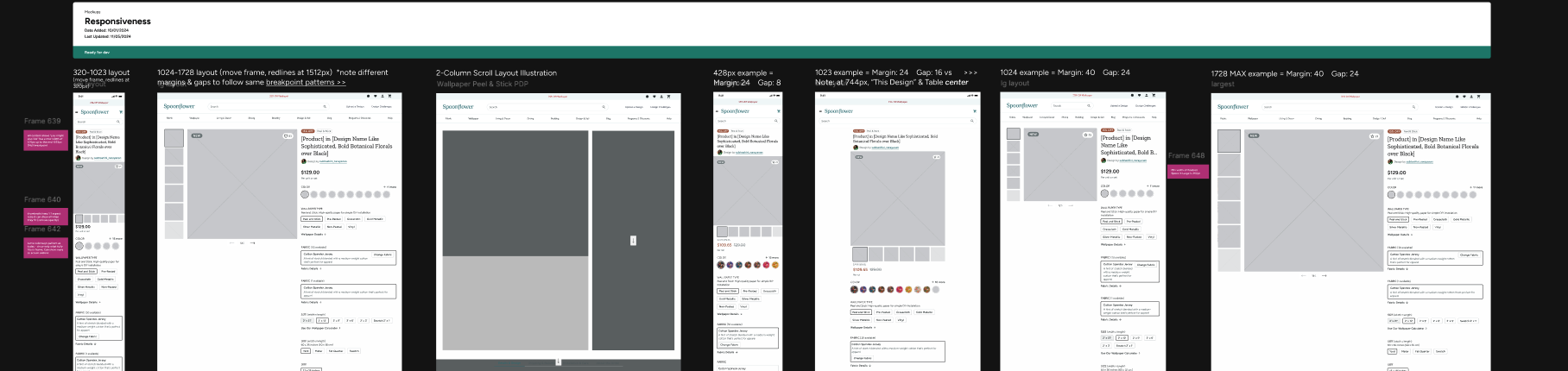
Responsiveness for the faint of heart
Developers could drag each of these frames to see how the layouts would respond and move across viewports. I provided additional redlining documentation and notes to highlight differences at key breakpoints.
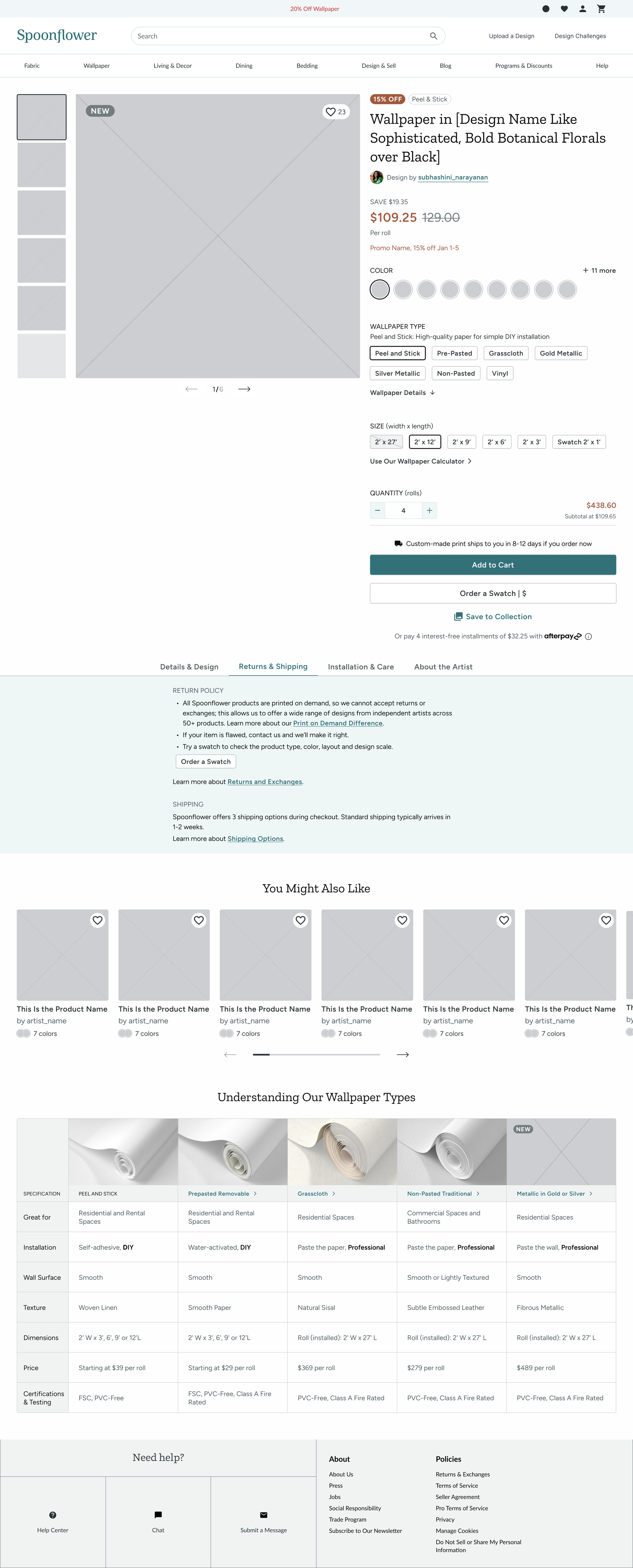
Wallpaper & Discounts Example
For the first launch, which includes a slightly more limited scope of features

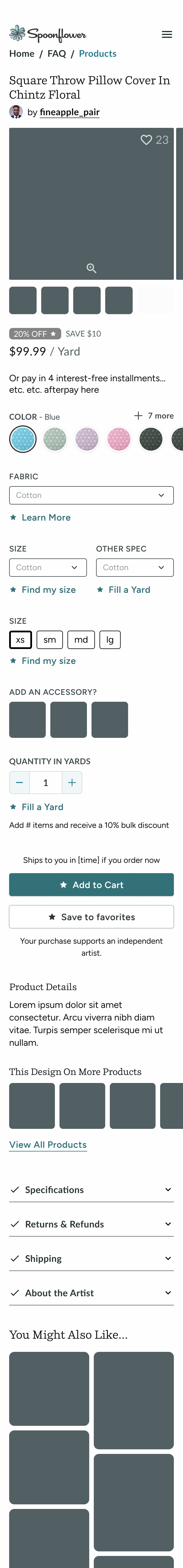
Fabric Example
With improvements such as an expandable view with measurements


Home Decor Example
Pillow Shams have more visual shape and size selection.


Perhaps you’re wondering…
Re-platforming had so many cost-savings and efficiencies associated that trade-offs had to be made; this was still done for the benefit of users.
Yes, we all wanted to add product ratings and reviews but were limited via technology, timeline, and content. It was on the list!
Why isn’t there more up/cross-selling? That also had to be de-prioritized while we improved our search and recommendations ability through AI.
The entire end-to-end Saving and/or Favoriting flows are on the list for an overhaul and complete redesign.
Thank you for reading through this redesign journey!