
Frame Dream
Digital product catalog
Vision Source (Frame Dream) wanted to update their digital experience for FrameDream.com. The purpose of the site is to drive users to checkout with their optometrist in-store. Historically, it had been used a static catalog for users to browse glasses and their specs.

“Users perceive that attractive things work better.”
- Don Norman

Challenge
Vision Source wanted to help users more efficiently order glasses through Vision Source’s optometrist partners. Currently, the brand website is static with no clear next steps or CTA and confusing product details. Additionally, Vision Source did not believe the website was ADA compliant. Also, they had not yet connected the Frame Dream brand with their overall branding.
Team
I was the UX Designer and worked with a UX Researcher.
-
Solution
I worked with a User Researcher to assess the current state of their website and provide recommendations.
-
Outcomes
Vision Source signed a contract with Credera to move forward with the website redesign and take their online catalog to a fully functional browsing and filtering ordering system.
-
Constraints
I had very limited access to business stakeholders, so I had to consider how branding, technical limitations, etc. would change after receiving more details and requirements.
-
Outputs
Future State Sitemap
Usability Assessment and Compliance Findings
Initial Design System
Wireframes
High Fidelity Prototypes
Sitemap
I noted MVP and “nice-to-have” pages

Heuristics Assessment
I wanted to better understand current gaps & opportunities


Competitor Analysis
I summarized best practices using Mood Boards

Wireframes
I created mockups of certain site elements, such as a favorite list, filter, email, etc.


Next, I put more thought into colors and typography.
I had to consider the way customers are most familiar with selecting products, so not all checkboxes and input forms are perceived as equal. We recognized this through 3rd party research as well.
Even with vague instructions and unclear branding guidelines, don’t play it too safe. I challenged myself to be more bold with proximity, style/feel, typography, and colors than other online Frame Dream brands.


In response to client feedback…
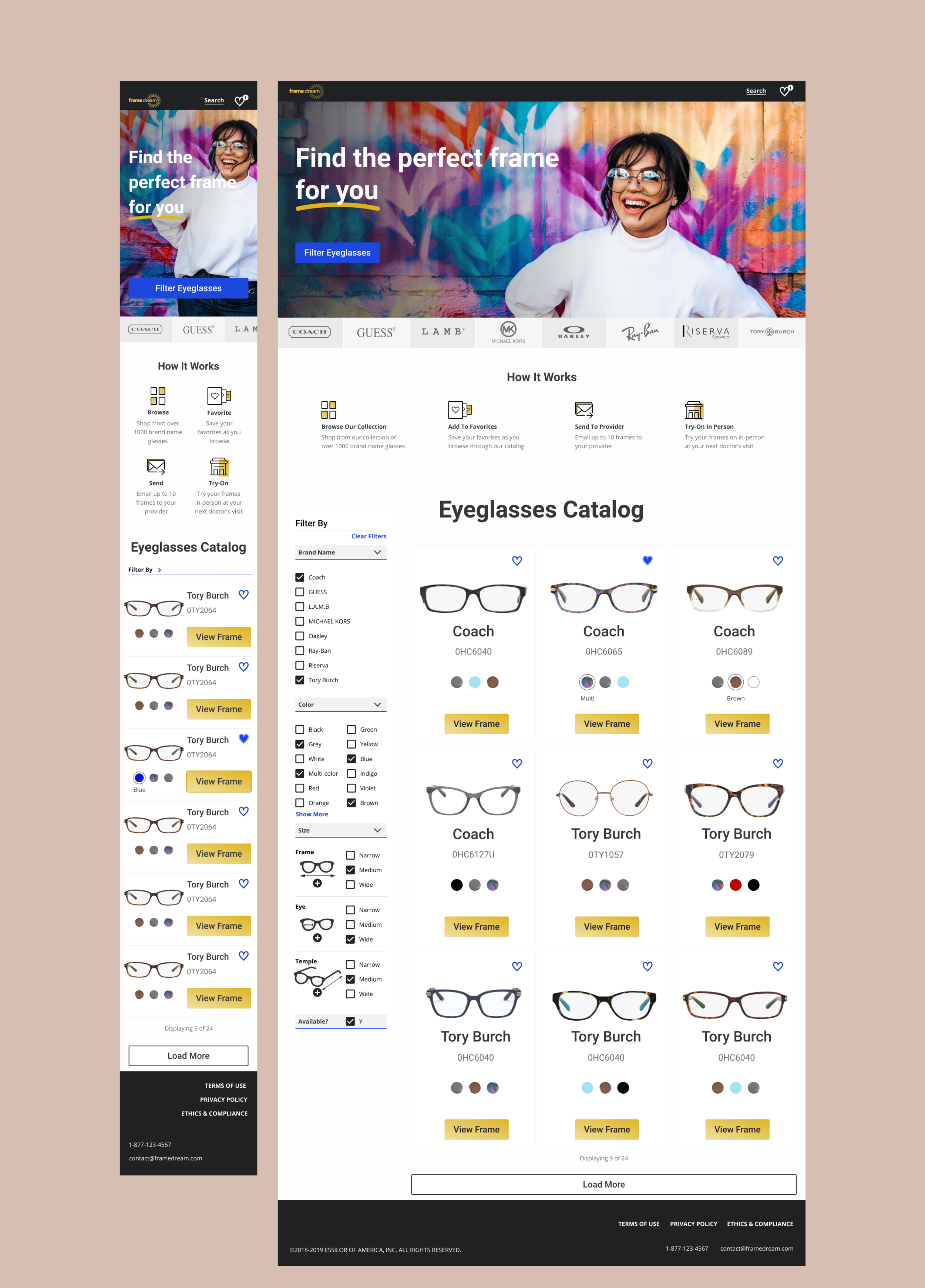
I added higher fidelity mockups of other pages in the sitemap as well.


A few other constraints
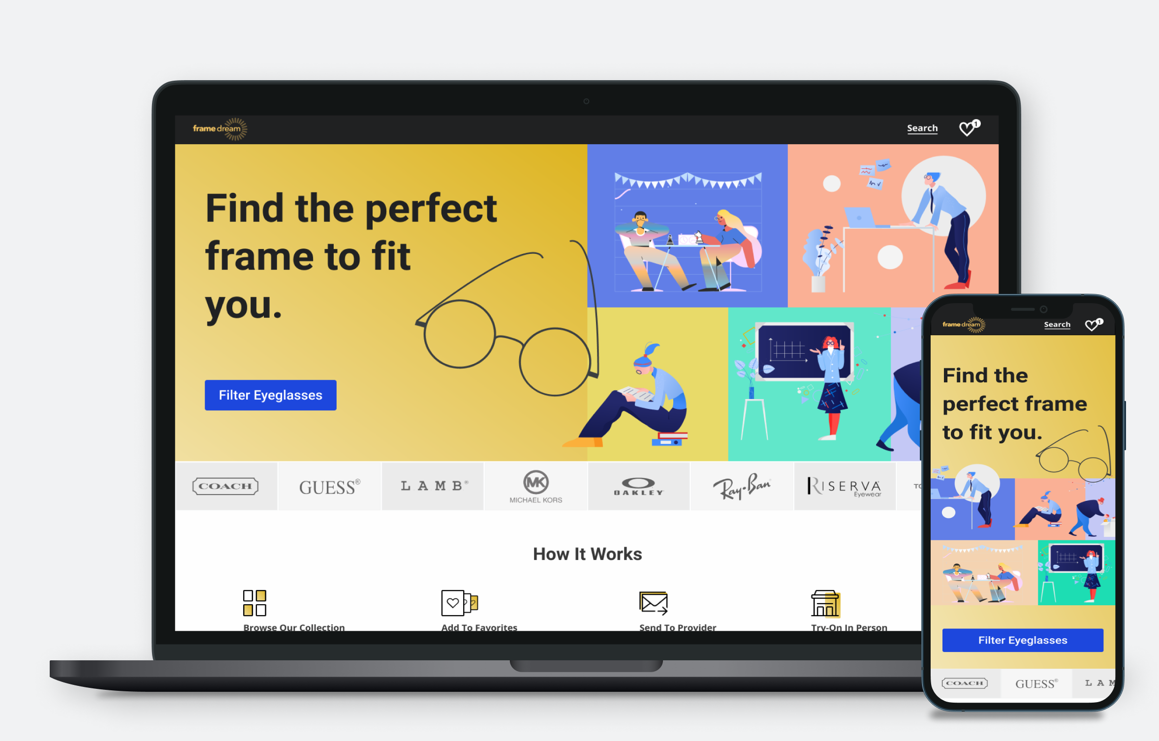
We didn’t have high-quality product or lifestyle images available, so for the landing page, I included in the recommendation that we should use a simple image with contrast so the text would be compliant. In the main example below, I called out that it was meant to be an example of using a lifestyle photo to better connect with the humans on the other side of the screen.
I also created an additional option to show emotion and personality that is a little different from other comparable brands.
Ultimately, I wanted a greater understanding of the user and their response to this journey, so I kept coming back to the importance of creating a User Research foundation and iterating on these designs before any development work should begin.
Polished Mockups


In the end…
My last step was putting my designs into a presentation and translating them to our business development team leadership who would present the pitch.
We received great feedback from our client, and they ultimately signed a new contract with Credera to build out a new online ordering system based on our recommendations.