UX Research >> Design
The goal of this client engagement was to identify key user personas, map user journeys, identify pain points and opportunities, and finally, design updates based on the latest and ongoing customer research to ultimately, increase conversions.
Note: The name of this company has been scrubbed to preserve confidential information.
Overview

Challenge
This fitness service and eCommerce company had just gone through a website redesign; however, the research used to make design decisions was rushed and spotty at best. For a few months, they noticed a trend of steadily declining eCommerce sales and they didn’t know where the drop-off in the user journey was occurring or why.
They had never created customer personas or mapped their user journeys before, so they were largely working off of assumptions.
Team
This was a lean team, and I wore many hats as the UX Designer and Researcher. I worked with 2 Developers, 1 Business Analyst, 1 Project Manager from Credera, a team of developers with the client, and a 3rd party marketing consultancy.
Solution
I created a foundation for user research, strategy, and insights to set an agile cadence for incorporating qualitative and quantitative data into all future design decisions. This led to implementing incremental design updates that we measured with A/B testing and a new product comparison page design which I presented to users for feedback.
Outcomes
1. Aligned content to user values and goals
2. Reduced confusion at checkout
3. Prioritized critical information to the user, for example, the Comparison Page, allowing them to gather specs and check out faster
Constraints
Due to quick timelines, we initially only had three weeks to identify key personas and the first draft of the corresponding user journeys.
We started with qualitative data, and I was able to layer in more quantitative data with surveys, analytics, and additional interviews over the next two months.
Outputs
2 User Personas
2 User Journey Maps
Backlog of development & design opportunities
Checkout flow design updates
Pricing & financing page updates
Additional content layouts
Comparison page design

Research outputs


Understanding the user journey helps prevent from designing in a “vacuum.”

Key Learnings
1. Demographic data was wrong.
The company believed their key users were single males in their 20s to 30s who had an average household income of ~$50k. In reality, their top user groups were ages 40-65 who lived with a partner, had about 2 children, and the average income was $100k and above.
They relied too heavily on Google Analytics demographic data, which only accounted for about 10% of their online users.
2. Visuals & messaging weren’t landing.
From videos to content strategy, the company was “talking past” their main audience, so messaging wasn’t sticking in the way executives imagined.
Since they lacked a fundamental understanding of their users, design decisions were made ad-hoc with few insights, and important assumptions were based on opinions and preferences.
3. The online experience wasn’t intuitive.
Developers and business stakeholders were confident that the site experience was straightforward. After personas were identified, through user testing, I discovered that the flow had room for improvement.
They didn’t talk to their users. They assumed that “they were their users.”
Testing Hypotheses
An updated, intuitive shopping flow

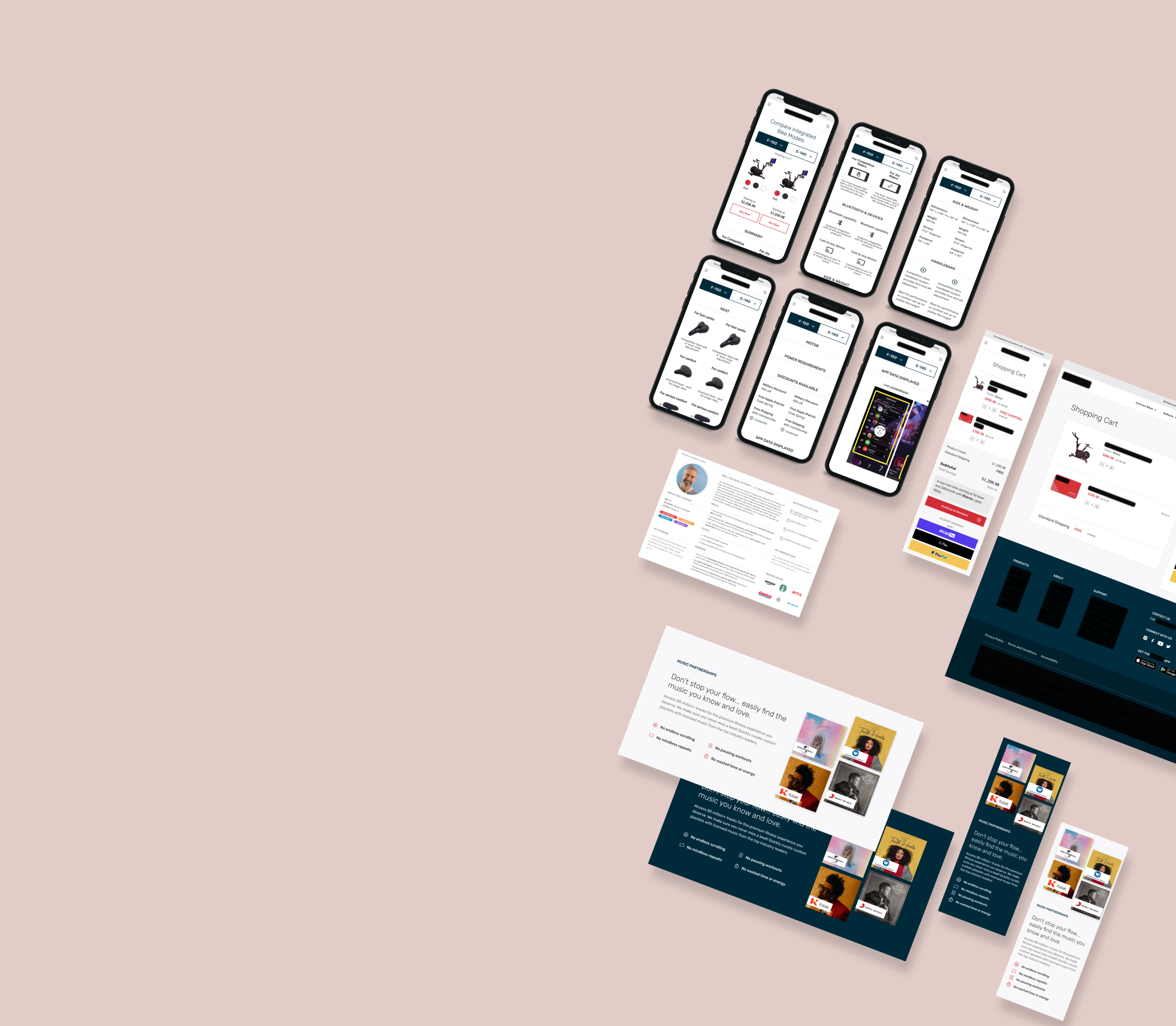
I learned from users that the pricing and financing options were confusing and unclear. I also learned that product comparison was a really important part of the buying process for them. Because of these findings, I adjusted the hierarchy of pricing so it reads the flat rate, then the monthly rate, and I added a comparison (secondary) button, so at this point in the journey, the user could easily navigate to see products side-by-side.
Copy and voice that speaks to users

Content sections weren’t created with their ideal audiences in mind. From interviews and reading reviews, questions, social media pages, etc., I adjusted the way their value proposition was presented so it reads more personal, casual, and straightforward. Simple changes like using images that the audience was more familiar with goes a long way. This example was a specific request from business stakeholders, and I was able to provide additional value to the user because I understood their wants, needs, and preferences as it relates to workouts.


Comparison Page View

How Users Responded


In the end…
We started User Testing and launched some of our A/B tests.
Unfortunately, for reasons outside of our team’s control, we had to pause the engagement.
Our client feedback was very positive, and they said they were happy with the deliverables we handed off to them.