E-commerce Checkout Design

I’m a UX/UI Designer II for Spoonflower - a vertically integrated marketplace for unique and custom designs on wallpaper, fabric, and home decor. We are redesigning and re-platforming the entire website, starting with the cart and checkout flow, in which I was the lead designer.
outcomes & outputs
+0.5%
Increase in purchase conversion
~30
New atoms/molecules/organisms in Pattern Library
-10
Decrease in the number of fields required to make a purchase
context
team
I was the sole designer for this work. I collaborated with a UX Researcher, a team of internal and external developers, and business stakeholders.
user needs
The old checkout process was long, cumbersome, and confusing. For example, the abandoned cart rate was too high above industry averages. They relied too heavily on users to remember and use their own personal “hacks.”
business goals
Improve purchase conversion, reduce tech debt, and increase brand awareness through visual consistency.

user flow
cart
A few interesting UI problems I solved:
The hierarchy and emphasis of the Remove CTA on small and large screens
The alignment on mobile is really satisfying
Actions are clearly spelled out without creating too much room for users to mistakenly remove an item
Quantity selection!
Users (of any thumb size) can easily type and incrementally increase and decrease quantities
Quantity measurement type
Now, users can clearly understand their wallpaper quantity is by the roll while fabric quantities are measured by the yard.
Setting expectations early
Displaying the “Shipping Options” on Cart helps to prepare users for longer delivery times due to the custom nature of the products they’re ordering
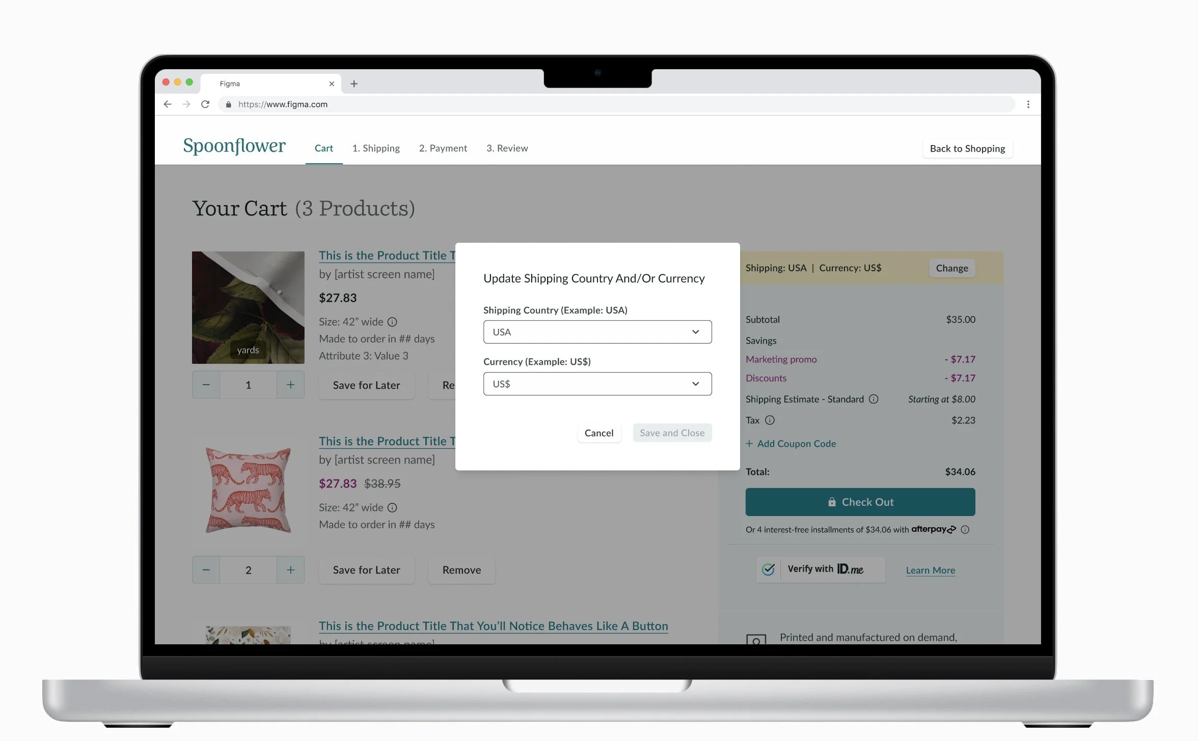
International Shoppers
Users can easily change their shipping and currency preferences BEFORE beginning checkout without leaving cart


Cart: Changing Shipping Address and Currency

cart

removing an item


account selection


shipping
A few key problems solved:
Reduced the number of fields, reducing complexity and increasing the speed of checkout
Improved readability and signifiers
Provided more guidance for users through progressive disclosure, field labels, and captions
Added browser auto-fill, address and zip code detection, auto-formatting for email, phone, and state, and zip code auto-fill


shipping: zip code auto-fill


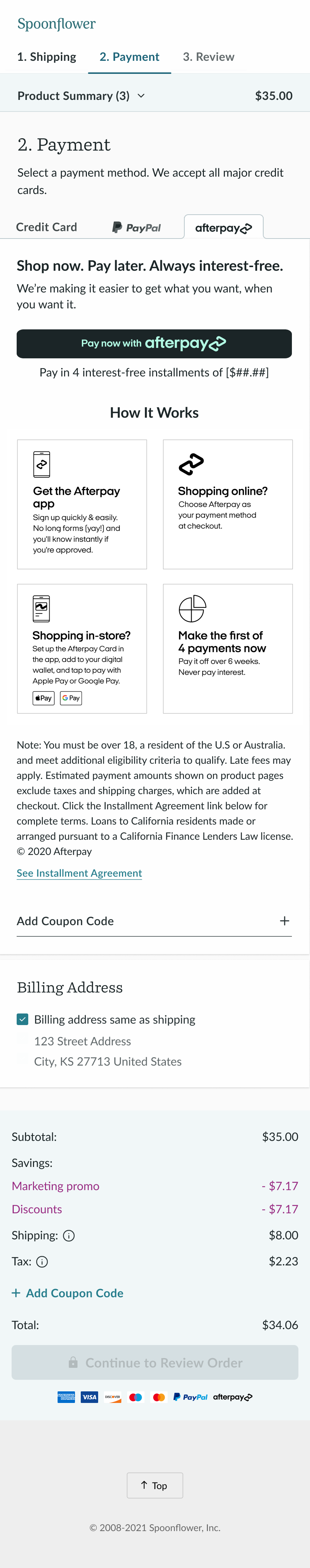
payment
A few key problems solved:
Clearly displayed 3 distinct payment options but set card as the default, reducing friction
Masked text and auto-formatting prevent users from making errors
Only asked for and automatically opened the fields that what we really needed
The out-of-the-box marketing materials for PayPal and Afterpay were not user-friendly or responsive, so I made some quick and simple visual improvements that still allowed developers to leverage the existing code.


Review
A few key problems solved:
Inline editing!
Users needed to make slight adjustments to their order without leaving checkout, so we allowed for quantity selection, removal, and saving for later.
Reduced cognitive load by: displaying their products for review, summarizing information entered, and reminding users they can create an account at the next step


order confirmation


outcomes & outputs
+0.5%
Increase in purchase conversion
~30
New atoms/molecules/organisms in Pattern Library
-10
Decrease in the number of fields required to make a purchase